Sibling list is hard to read

+7 votes
170 views
Especially in large families, the comma-separated list of siblings is hard to read. And, while they are sequenced chronologically by birth date, when traversing the siblings' profiles, it would be nice to know where in the list the current profile sits. I suggest a bullet-separated list (•) to stand out better than commas. And, put some special symbol (perhaps ★) where the current profile fits in the list.
in WikiTree Tech by Kenneth Nellis G2G6 Mach 1 (12.1k points)

1 Answer

+5 votes

Kenneth, it may be a while before that is implemented by WikiTree but Ian Beacall has developed a Chrome extension which is marvelous. It is a quick way to make tables, but there is also an option in the extension to display the lists of the siblings and children one beneath the other, numbered, and with the profiled individual included in the list. You can see a G2G discussion of this extension here.

by Nelda Spires G2G6 Pilot (563k points)
Thanx for that, Nelda. It may be good for others, but not the general audience. I, for one, don't use Chrome and I eschew extensions.

Saying it won't happen for a while, are you speaking for WikiTree developers, or just opining based on personal experience?

―Ken
No, I don't speak for the developers at all. Changes, though, can come slowly for some things. I suppose if enough of us clamored for this, it may get done sooner. I'm sorry you don't use Chrome so the extension will not be available to you. It really is quite a marvelous extension.
I  hope - if that is ever implemented - it is optional.  Profiles are long enough now, but if you add a vertical list of siblings and also a vertical list of children -- it would be worse than when the categories were all at the top of the profile.

There were some couples that had more than 20 children - and if there were multiple marriages -------------- I don't even want to imagine how long the profiles would get,

I think this problem of view is not universal.  I've never had a problem looking at the siblings, or the children, as currently presented.

However, the suggestion regards insertion of a symbol of some kind to indicate the position in the list of where the currently viewed profile sits isn't a bad one.
Melanie, Ian's extension, and most probably something the WikiTree developers might come up with, does extend the length of the bio top portion of the profile page and thus increases the scrolling necessary to get to the actual bio. In the traditional WikiTree view, for me, the names just run one into the other. I suppose it's because my vision is not so great anymore. Even with glasses and having my screen view zoomed to 125% I still have difficulties. So, it's wonderful for me. I expect, though, unless there were a way for it to be made optional (as it is with Ian's extension) such an "improvement" would not be welcomed by most at WikiTree, which is sort of why I told Kenneth in my initial reply it may be a while.

I wonder if spacing  the names more would help.  You can do it in word documents.  (I just cannot help but see those 22 kids in a top-to-bottom list, and then siblings as well.  surprise

I'm currently working with a few Irish Catholic families, and their child / sibling lists are plenty long enough as is. 

Having the lists on the right side of the page in edit mode is where I typically worked from before I installed Ian's app. But having them listed on the right in the profile view rather than at the top of the page would be nice but would require a MAJOR redesign of the profile view and I bet that will never happen. Yes, some additional spacing would help. For me, the underlines of the hyperlinks just seem like one long continuous underline--I barely see the commas between the names. I work on a laptop with a 17" screen. I cannot imagine what it is like for those trying to work on tablets.

Kenneth:  As Nelda said... maybe you could try it out.  I think it's exactly what you're looking for.  I think the developers are much too busy with other things for them to be spending time on this, especially as there are such strong views against it for some reason. Making it an option would solve this problem, but, as I said, they seem to be very busy.

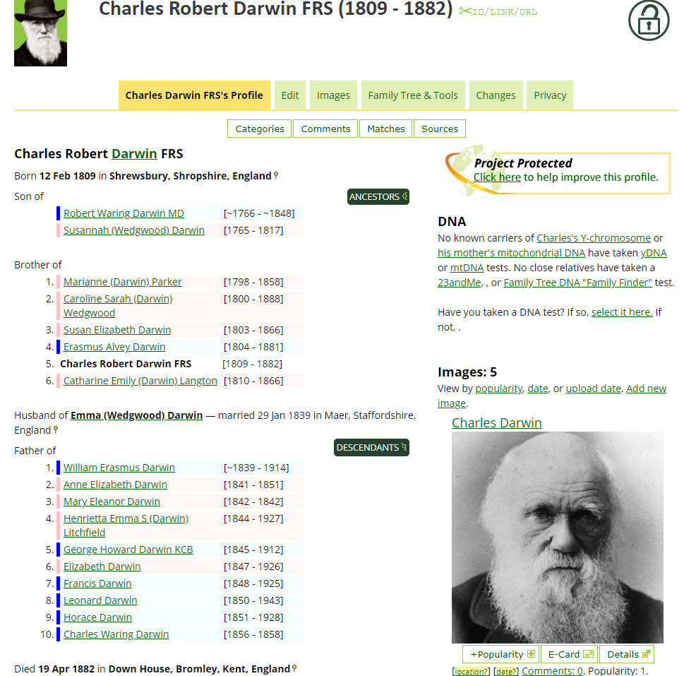
Melanie: Yes, Kenneth was asking about some kind of marker to show where the subject of the profile sits in the birth order.  The good news is that my extension does that. smiley   Here's one example:

Surely that's easier to read and understand than the current horizontal lists? 

And another small point (Melanie), you're talking about the profiles of people with many children being too long if the list is vertical, but it's exactly those ones that are the most difficult to read when they're listed horizontally.  With only one or two siblings, a horizontal list isn't so bad, but the long ones are really confusing. 

 (And before anyone says... "But Charles is not a 'Brother of... 5. Charles' ", I know that.  And you know that, too, so... maybe we're OK. wink

Nelda, putting the family on the right is a great idea! I never look at anything in the right column anyway...

Here's how it looks:

I'll finish the update soon, so that'll be in your browser in a few days.  (I need to wait another day or so for the latest update to go through, then upload this, and then you'll have it a day or so later.  smiley)

Related questions

+7 votes
2 answers
+3 votes
1 answer
107 views asked Nov 6, 2022 in Genealogy Help by Benjamin Pehrson G2G1 (1.8k points)
+3 votes
5 answers
790 views asked May 7, 2022 in Genealogy Help by Sharon McArthur G2G3 (3.6k points)
+4 votes
1 answer
328 views asked Mar 19, 2022 in Genealogy Help by Rudy Ramsey G2G3 (3.3k points)
+3 votes
1 answer
+3 votes
5 answers
216 views asked Dec 15, 2018 in Genealogy Help by Barry Smith G2G6 Pilot (293k points)
+8 votes
3 answers
202 views asked Jul 4, 2023 in Policy and Style by E. McCraw G2G1 (1.6k points)
+6 votes
1 answer

WikiTree  ~  About  ~  Help Help  ~  Search Person Search  ~  Surname:

disclaimer - terms - copyright

...